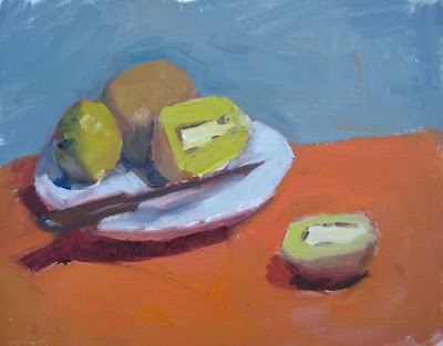
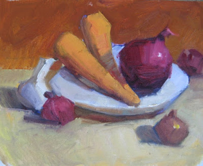
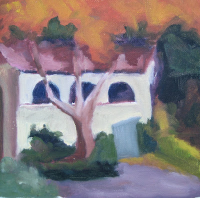
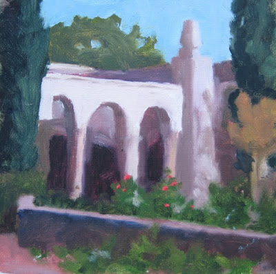
I completed my oil painting class with
Timothy Tien. Here are my remaining paintings from the class, and notes from my recollection of what I learned. In the order they popped into my head. I need to practice with oils, but I think the class was very helpful. I am more aware now when I look at things and when I paint them. I will continue to make the same mistakes, but I will recognize them and learn from them, until good design and painting principles are like breathing.
Design and composition are most important. It doesn't matter what the painting is. It may be an abstract, and the same principles will apply.
A triangle is a good design - if lines and shapes in the painting make a triangle, it will help it be a good design.
There should not be big solid unvaried shapes, unless you want them to be the most important thing in the painting.
Shapes can be broken by variations in value and temperature as well as lines.
The painter should relocate elements to improve the design.
Know why you place elements where you place them and what affect it has on the composition.
Patterns of dark and light are important because they are most visible. Squint your eyes and lay them in first.
Artists draw shapes with straight lines because it helps to give them direction and locate the planes for light and shadow areas and highlights.
Contrasts are important - light & dark, warm & cool, large & small, horizontal & vertical.
Things in the painting should not be equal.
It doesn't matter what your subject is. What you paint won't always interest you; it is your job to make it interesting.
You should know what the most important thing in your painting is. It might be an object or a group of objects or a shadow or the foreground. It is what you want the viewer to look at. It is the story that your painting is about.
Colors have the most intensity when you look directly into them. If they are in the periphery of your view, they will seem less intense. The important thing in the painting should have the most intense color.
You are limited by the paint on your palette. You can't paint anything lighter than white or more intense than your pure color.
Start finding your colors with the most intense color; everything else will key off of that.
It is the relationship between the colors rather than the individual colors that you are painting. Look at the interplay between your colors, even as you mix them on the palette; try them next to each other.
Test the background color in different parts of the painting. It should make objects appear to come forward. The background and background objects define the edges of the objects in front.
It is oil paint. You can cover anything.


