
Showing posts with label oil paint. Show all posts
Showing posts with label oil paint. Show all posts
Monday, April 21, 2014
Eventually You Reach Water


Thursday, September 5, 2013
On Broadway

The Last Remaining Seats is a program of the Los Angeles Conservancy, where older classic movies are shown on big screens in the historic movie houses in Los Angeles. I think my husband and I got onto this in its early years, almost accidentally, because my son, rather inexplicably, fell in love with Laurel and Hardy. Parents are willing to go out of their way to witness their small boy laughing with reckless abandon. Broadway in Los Angeles was lined with theaters at one time and some of them still remain, some restored and some repurposed. Just a few years ago, Broadway was mainly a shopping district filled with new immigrants and cheap electronics. Trendy hipster restaurants are popping up now.
I'm an older person now. I don't even wait around for people to ask me what it was like when I was young. I tell them. I didn't like history when I was a kid. The first time I was interested in history, my grandparents were already dead. And I thought about how the world must have looked to them, as World War I began or as cars took to the roads.
Sunday, August 18, 2013
In Pictures

I was able to park across the street and stand in a shady spot and paint this view on a small canvas panel. I was impatient to start painting, so I didn't do any planning that took the foreground into account, and I think it shows.
Thursday, August 8, 2013
Schooled
As you may know, in the midst of all my water-coloring, I've been learning oil painting. At it's most basic, it's pretty much the same thing. Two dimensions, brushes, and a limited range of colors and values to express some visual idea. My class is on Wednesday night, but we're on a brief hiatus while Tim Tien the instructor goes out on the summer plein air circuit. Since this is Wednesday, I should probably be practicing, but at least I'm thinking about it.

 So, here's some paintings from class. I think they're not too bad, but then again I know I thought that before I got even this good. I think in a bind I could possibly sell these to pay for more classes. I've learned to draw a little more conscientiously, grouping objects together into big shapes, and comparing size, shape and angle.
 I'm working on the mechanics of mixing color and applying paint, but also on practicing seeing. I drive home from work now observing where the sky is darker than objects in front of it, and where it's lighter.


I like oil paint. It has a lovely consistency that changes a little with the weather. Oil paintings look substantial and solid.
Thursday, December 9, 2010
What I Learned
I completed my oil painting class with Timothy Tien. Here are my remaining paintings from the class, and notes from my recollection of what I learned. In the order they popped into my head. I need to practice with oils, but I think the class was very helpful. I am more aware now when I look at things and when I paint them. I will continue to make the same mistakes, but I will recognize them and learn from them, until good design and painting principles are like breathing.
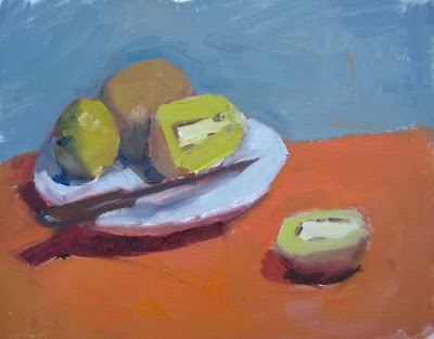
Design and composition are most important. It doesn't matter what the painting is. It may be an abstract, and the same principles will apply.
A triangle is a good design - if lines and shapes in the painting make a triangle, it will help it be a good design.
There should not be big solid unvaried shapes, unless you want them to be the most important thing in the painting.
Shapes can be broken by variations in value and temperature as well as lines.
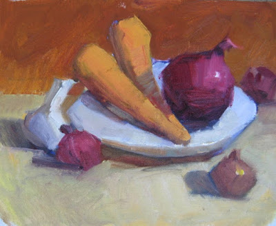
The painter should relocate elements to improve the design.
Know why you place elements where you place them and what affect it has on the composition.
Patterns of dark and light are important because they are most visible. Squint your eyes and lay them in first.
Artists draw shapes with straight lines because it helps to give them direction and locate the planes for light and shadow areas and highlights.
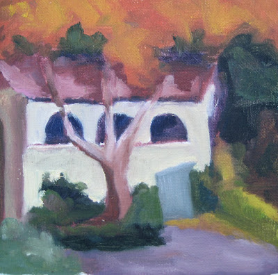
Contrasts are important - light & dark, warm & cool, large & small, horizontal & vertical.
Things in the painting should not be equal.
It doesn't matter what your subject is. What you paint won't always interest you; it is your job to make it interesting.
You should know what the most important thing in your painting is. It might be an object or a group of objects or a shadow or the foreground. It is what you want the viewer to look at. It is the story that your painting is about.
Colors have the most intensity when you look directly into them. If they are in the periphery of your view, they will seem less intense. The important thing in the painting should have the most intense color.
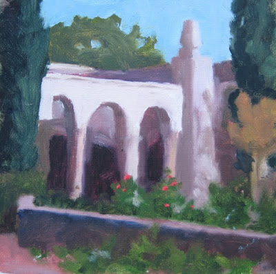
You are limited by the paint on your palette. You can't paint anything lighter than white or more intense than your pure color.
Start finding your colors with the most intense color; everything else will key off of that.
It is the relationship between the colors rather than the individual colors that you are painting. Look at the interplay between your colors, even as you mix them on the palette; try them next to each other.
Test the background color in different parts of the painting. It should make objects appear to come forward. The background and background objects define the edges of the objects in front.
It is oil paint. You can cover anything.

Design and composition are most important. It doesn't matter what the painting is. It may be an abstract, and the same principles will apply.
A triangle is a good design - if lines and shapes in the painting make a triangle, it will help it be a good design.
There should not be big solid unvaried shapes, unless you want them to be the most important thing in the painting.
Shapes can be broken by variations in value and temperature as well as lines.

The painter should relocate elements to improve the design.
Know why you place elements where you place them and what affect it has on the composition.
Patterns of dark and light are important because they are most visible. Squint your eyes and lay them in first.
Artists draw shapes with straight lines because it helps to give them direction and locate the planes for light and shadow areas and highlights.

Contrasts are important - light & dark, warm & cool, large & small, horizontal & vertical.
Things in the painting should not be equal.
It doesn't matter what your subject is. What you paint won't always interest you; it is your job to make it interesting.
You should know what the most important thing in your painting is. It might be an object or a group of objects or a shadow or the foreground. It is what you want the viewer to look at. It is the story that your painting is about.
Colors have the most intensity when you look directly into them. If they are in the periphery of your view, they will seem less intense. The important thing in the painting should have the most intense color.

You are limited by the paint on your palette. You can't paint anything lighter than white or more intense than your pure color.
Start finding your colors with the most intense color; everything else will key off of that.
It is the relationship between the colors rather than the individual colors that you are painting. Look at the interplay between your colors, even as you mix them on the palette; try them next to each other.
Test the background color in different parts of the painting. It should make objects appear to come forward. The background and background objects define the edges of the objects in front.
It is oil paint. You can cover anything.
Thursday, November 11, 2010
Pomegranate and More

My fourth class with Timothy Tien, placing me at mid-term. This was an easier still life, since Tim didn't bring the blue bottle that was going to be the challenge. The pomegranate was challenging enough. It has an odd but interesting shape and difficult coloring - bright here and muted there. It has to compete for attention with a couple of bright yellow lemons.
I learned again the importance of backgrounds to still life paintings. The color of the background should bring the objects forward; the background will define their edges. It should compliment, but not distract. It shouldn't be too big an unbroken shape, but it shouldn't be choppy. This background is remarkably similar to the background used in school portraits.
And I got to paint a little brown jug.
Thursday, November 4, 2010
Painting Lessons

This is the painting from my third class with Timothy Tien. We skipped last week. He sets up still lives that are fraught with problems such as many similar hues, bright backgrounds, shadows on dark surfaces, and objects that barely show. I need to find the story - the main and supporting actors, the composition, the pattern of dark and light. My big mistake this time was laying in the background first, and then trying to adjust the watermelon color. Better to start with the watermelon, which should be the most vividly colored. So I redid it. Tim liked my persimmon, I understand because it reads true without being literal. It took a while. The whole time I was smelling watermelon.
I don't know why canvas boards photograph so badly.
Friday, October 22, 2010
Classwork

This is the painting from my second class with Timothy Tien. There is a fair amount of Tim's work on this painting. Ordinarily I'm pretty adverse to instructors drawing or painting on my work, but I'm determined to get the maximum benefit from this class. The emphasis of class so far (to review, for my benefit) has been on design, drawing, composition, choices, and contrasts. Plus basic suggestions on how to lay out a palette so there is space for mixing dark colors and space for mixing lights. Possibly there are life lessons in this.
Thursday, October 14, 2010
Trying Again

I signed up to take a beginning oil painting class with Timothy Tien on Wednesday nights. It turns out I am the only student. For all that I wish there were other students, and the focus were not entirely on me and my painting, I think this is pretty amazing opportunity to learn to paint. I'll let you monitor my progress. I painted this in the first class.
Sunday, June 20, 2010
Hale House

This was painted at the Heritage Square Museum, which is kind of like a retirement home for old houses. The Hale House was its first resident - a gorgeous and quirky Victorian; I chose to paint only this small detail of window, because I know my limits and because I was attracted to the colorful sun-catching planting.
My first foray into gardening was indoor potted plants when I was in my teens. I had only to find a nice spot for the plants and water them, and they rewarded me with life, lush greenness and oxygen. I branched out into flowers next. It was much trickier to keep plants alive outdoors, with a variety of weather conditions and herbivores. Yet it was more than just keeping them alive; I needed to encourage beautiful blossoms as well, possibly even fragrant and colorful blossoms. when I took up cultivating fruits and vegetables, there were new areas of concern: my plants needed to produce in quantity, and my fruits and herbs should have a pleasing texture and flavor. My prizes should grow to a proper size and juicy ripeness.
Art has been quite a lot like gardening for me. A painting consists of subject, composition, lines, values, colors, and technique. Sometimes I can't get any of those to work. The more I try to paint, the more respect I develop for painters. Paintings that I once would have written off as bland or trite, now show me a level of mastery I know can't even touch. Wish me luck. And water and sunlight.
Saturday, June 12, 2010
Wilderness Park

I took a different approach to this painting. I had a single large and slightly damaged canvas. I used up a lot of time before I started painting, and I didn't have a sketch that I liked much. Because I have come to hate cleaning brushes, I set to painting with one of my most beat up large brushes. I had no particular worry about screwing anything up; I just didn't want to go home without a painting again. I think reckless abandon may just be a good thing. If I can't get my colors right, I might as well make them bright and beautiful.
This was painted at Wilderness Park in Arcadia. The stream is just a trickle right now, and the ranger told me that's probably because Santa Anita Dam is old and a little leaky. I remember once wading there in fast icy water. I saw a fox at Wilderness Park once too. It might have been the inspiration for the reddish blurs.
Sunday, May 30, 2010
Cobb Estate

I used to go to the Cobb Estate fairly often starting when I was in high school. It was a wild place where we could get a bit wild ourselves, but also a peaceful place, where I went when I needed to ponder life changes, such as losing my first job. It consists of the foundations of an old mansion and impressive landscaping which has reverted to nature. It provides access to fine hiking trails. The property was saved from development by students, neighbors and friends who ensured the Cobb Estate will remain a wild and peaceful place forever.
There was a steady stream of hikers past where I was painting. Many people kidded about posing for portraits. Many dogs wagged their tails at me. It was not a place to paint in seclusion.
The thing that is the most seriously wrong with the painting is the value of the shadows. I may even take the paint to it, although it would be the first time I'd ever adjusted a plein air painting or used the oil paints at home. But it's not like that's based on anything more significant than laziness.
Monday, May 24, 2010
Meridian Iron Works

This interesting little building currently houses the South Pasadena Historical Museum. A very sizable part of South Pasadena history concerns ostriches and their feathers. I also learned at this museum that the Bauers of Bauer pottery once lived at the corner of Fair Oaks and Monterey, where I buy my groceries.
My photograph may be out of focus, but possibly not; the overhanging oak at the top looks in focus. The painting has a soft almost dreamy look that I like. It was a very pleasant day of painting.
Friday, May 21, 2010
Brookside Park

I realized Saturday is coming around again, and I still haven't posted last week's painting. As you can see, I'm still using the oil paints. No harm I guess; there's a certain momentum.
This is the place where my son's friend used to have his birthday parties when he was a little kid. It is a picnic area in a giant urban park that hosts an aquatic center, children's museum, the Rose Bowl, a swap meet, and a golf course. For starters. At yet this place is tucked out of the way, almost a secret. The stone wall is a relic of another time. I love stone walls by the way - the old ones where the stones were chosen specifically for balance and because they do not match. I painted my stones a bit too round and regular. I tried to pay a lot of attention to the values when I painted this, and I think it helped, although nature's light was much better. Near where I was painting, there was a Hobbit house.
 I mean seriously, what else could it be?
Sunday, May 2, 2010
Hahamongna

I painted at Hahamongna Watershed Park. Quite a name, yes? It was the name of a tribe of Tongva people who used to live in the area. Before JPL, before the freeway, before Devil's Gate Dam. Now the area is occupied by disc golfers, birdwatchers and dog walkers. But, oh the old oak trees, and the birds and wildflowers. And views of majestic mountains, and slightly less majestic hillside homes.
When I started to paint this, it seemed like an interesting composition. There were dramatic morning shadows on the mountains and a pair of phone poles on the left. The sun got higher and ate the shadows. Lack of time and painterly courage eliminated the phone poles. The result is pretty disappointing to me. I'm thinking about putting down the oils for a while, and focusing exclusively on the watercolors. I only really have a few hours a week to paint right now, so focus will be useful.
Saturday, April 17, 2010
Hugo Reid Adobe

In most of the world, and even the rest of the country, you can find seriously old buildings. In California, 150 years qualifies as extremely old.
This is another 12x16. I missed breakfast, and got faint with heat and/or hunger before I was finished with this. I'm not sure it was worth it. But anyhow, I've used up all my blank canvases (except one that smells like mildew.) I think I'll get smaller ones. I think I learn as much on 8x10, and I think my chances of catching and condensing a moment of beauty are every bit as good. At least for now. Until I have bigger brushes, and work faster, and find a subject that screams to be a monumental painting.
Saturday, April 10, 2010
Mary's Market

Mary's Market sits somewhere between the heart and the foot of the eclectic enclave that is Sierra Madre Canyon. The setting is idyllic. There was a babbling brook (or the equivalent) right behind me as I painted, and two robins were foraging there. The people of Mary's and their customers were very nice and friendly. A couple of especially wonderful locals loaned me a place to park and hosted me for lunch at Mary's. Mary's is even cooler inside than out, I think, except it doesn't have the trees and babbling brook. It does have very good coffee and food.
I struggled quite a bit with this painting, but in the end I'm kind of happy with it. I especially like the background - the house and the trees. My oil paint trees improve a little each week I think. I think I did well to generalize the cars and the patio. The front of the market got a little too precious, but then the sun came out and made some interesting shadows. The photograph has some sunlight and shadows too.
Saturday, April 3, 2010
The Green

Today I painted in Central Park, the slightly less famous Central Park in Pasadena. This is 12x16 - much larger than the plein air paintings of previous Saturdays. For that, if nothing else, I'm pretty happy. I managed to slap together a credible 12x16 oil painting in only 3 hours. I easily found a parking space, which was not metered until 11. I forgot my sketchbook and paper towels. I passed up a lucky penny. I got totally absorbed in my painting, and didn't notice that 11 o'clock came, and sometime after that parking enforcement came, and ticketed my car which was about 100 yards straight ahead of where I stood. So this is at least a $42 painting. Bad greedy old Pasadena.
I think the painting is not nearly contrasty enough. The colors are interesting, but the values don't sing. Perhaps a value sketch would have helped. I have figured out how to use the alarm feature on my cell phone, and will use it to avoid further parking tickets.
Saturday, March 27, 2010
Eaton Canyon

I scoped out Eaton Canyon on Thursday, and I thought I might paint a sycamore tree in the picnic area with one of those WPA-looking barbecues. But this morning I turned my eyes to the hills. It seemed like the greater challenge to me, but with better potential returns. It's a rare day when our hills are this green, and colored with wildflowers and new growth.
I got a parking spot and stood in the shade and painted almost without adversity. Two gnats were inadvertently killed in the making of this painting.
Sunday, March 21, 2010
Bridge

It's difficult to be a representational painter in the Pasadena area and not paint the Colorado Street Bridge. I would hazard to say it is easily Pasadena's most painted feature. There may be painters who have made careers of painting nothing else. There is a constant demand for bridge paintings to decorate the offices of Pasadena professionals. It really is a special bridge; it is exceeding long and curves over its course. It's nearly 100 and features lovely arches and lights. A painting of the bridge must necessarily include much of the sky, possibly at sunset. It will likely include hundreds of trees. Depending on the angle, it might take in the mountains or an old hotel.
In its distant past, the Colorado Street Bridge served as the jumping off point for many suicides, but they've added grating to put an end to that. People still call it Suicide Bridge. I used to call it that, but I hear it less and less. Good thing. Better we should paint it.
So I took the plunge on Saturday, and painted the Colorado Street Bridge for the first time. I went with my newly formed Saturday paint out group. Parking again was extremely challenging. One of the downsides of Saturdays, and economy that's keeping people away from the mall.
I'm getting more used to oil paint. You can't layer it like watercolors, and the colors don't even really mix the same. Inspired by Elio Camacho, I left burnt sienna off my palette, and added thalo green. The colors may be a bit extreme, but that may be good.
Subscribe to:
Posts (Atom)